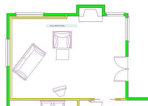
Some thoughts on room orgainization
February 24, 2008
But, the starting point is just where to put the couches.
Option 1:

Option 2:

Any other ideas??
The TV needs to go along the bottom wall, since that’s where the jacks are. (I laughed. Kevin’s been angling for a bigger TV for ages – long before we found this house – and I’ve been resisting, as usual. A combination of cheapness (thrift?) and general opposition to buying TVs. But the to-scale diagram of the room with the to-scale tv makes it look like a 12”. We still won’t be buying a TV tomorrow, but I was amused enough to call him in and concede the point. Our 3-ft wide TV is puny compared to the room.)
We’re thinking we’ll also do a reading corner in the upper-right corner by those windows, or perhaps a puzzle table. It looks teeny compared to the room but it’s a 5½ x 7½ foot space, so it’s not that small.
Labels: home improvements


1 Comments:
I think the cable location is the issue. If it was on the fireplace wall near the door to the patio, you could set up the couch and chair to see the TV, fireplace and patio. Could you extend the cable under the floor of the family room?
By Anonymous, at 5:19 PM, March 05, 2008
Post a Comment
<< Home